
Sunday, 30 January 2011


Thursday, 27 January 2011
Thursday, 16 December 2010
Main Task: Double Page Spread Examples

I liked the way this double page spread was laid out as the image of Bashy took up one page, so most of the text is on the left page.

I liked the way this double page spread was laid out as the image of Giggs and Tinchy Stryder took up the half of the right, so most of the text is on the left page and the rest is underneath the image.
For my double page spread I think that I will use a similar layout to this.
Wednesday, 15 December 2010
Main Task: Contents Page Examples

Main Task: Front Cover & Double Page Spread Images


Here are the images I took for the front cover of the magazine. I took various shots of the artist so I would have a variety. I also took pictures with him in different clothing so it gives me a better chance of getting the most appropriate picture for the front cover.

Main Task: Masthead Designs
Before I started to create my magazine I had to decide on my masthead. I went through a few possible names for the magazine. Finally I decided on using ‘Wavey’. I decided to create my masthead in Photoshop CS4. I started to experiment with different fonts and colours as I wasn’t sure on what colour scheme I wanted. I then decided to use the font Amsterdam Graffiti as this seemed suitable for the look I was going for. I then added a star behind the ‘a’ in the text and made the text blue, as you can see below:

Friday, 26 November 2010
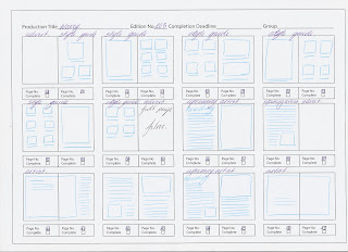
Main Task: Flat Plan
The three pictures below are the flat plans that I produced to show what would be in my magazine if I was to create a whole magazine. This exercise helped me understand how much effort and time goes into thinking about what should be in a magazine. Doing the flat plan made me notice how much advertisements go into a magazine. From this I thought about what kind of adverts would be in my magazine. As the magazine was targeted at 16+ I thought that adverts from JD Sports, Foot Locker, Lynx, Films and hmv would be the most suitable for my magazine.
In my flat plan you can see that there is slightly more image then text, this is because I think that my target audience would prefer to look at the images than to read the text.


Main Task: Interview Planning Process


I started planning my interview with this artist, Yardish on the 26th November as you can see from my print screen. To get in contact with this artist I used the social networking site, Facebook. As he is an upcoming artist I didn’t think that I would get a reply so quickly, as you can see from the print screen he replied 1 hour later.
As we were unable to meet up due to us both not being free at the same time I had to send the questions to him over Facebook. I sent these on the 3rd December 2010 at 19:21. As you can see from the print screen he sent me his response on the 4th December 2010 at 14:13.
Friday, 19 November 2010
Main Task: Other Music Magazines
During my media lesson I started to do some research on other magazines that have a similar target audience to what I was going to produce and magazines that are the same genre. While doing this I came across the following magazines:
· RWD
· Vibe
· Hip Hop Connections
· Spice
· Source
I then decided that RWD and Vibe were more similar to the kind of magazine that I wanted to produce. So I decided to use these magazines as an influence on the way I make my music magazine.
Thursday, 18 November 2010
Main Task: Music Magazine
I have been asked to produce a front cover, contents page and a double page spread of a music magazine. I decided to do a magazine with a mixture of genres but main focus on Grime and R&B as this is the type of music I listen to. As I was doing a magazine on those genres I decided that the magazines target audience should be 16+.
Definition of Grime (http://en.wikipedia.org/wiki/Grime_(music))
Grime is a genre of urban music that first emerged in Bow, East London, England in the early 2000s, primarily a development of UK garage, dancehall and hip hop.
Definition of R&B (http://en.wikipedia.org/wiki/Rhythm_and_blues)
Rhythm and blues is a genre of popular African American music that originated in the 1940s. The term was originally used by record companies to describe recordings marketed predominately to urban African Americans, at a time when “urbane, rocking, jazz based music with a heavy, insistent beat” was becoming more popular.
The term has subsequently had a number of shifts in the meaning, In the early 1950s and beyond, the term rhythm and blues was frequently applied to blues records, Starting in the 1950s, after this style of music contributed to the development of rock and roll, the term ‘R&B’ became used to refer to music styles that developed from and incorporated electric blues, as well as gospel and soul music. By the 1970s, rhythm and blues was used as a blanket term for soul and funk. In the 1980s, a newer style of R&B developed, becoming known as contemporary R&B.
Wednesday, 17 November 2010
Preliminary Exercise
For my preliminary exercise, I was asked to create a front cover and a mock up of a contents page for a new school/college magazine. I took a picture of a student for the front cover of the college magazine; this was a medium close-up shot. I then appropriately laid out the text and the masthead of the magazine.
Preliminary: Front Cover

This is the front cover of a college magazine that I have produced. This exercise helped to establish the various photo shot sizes. As you can see I have used a medium close-up shot of the student on the front cover. After I had experimented with a few colours I choose to use the colours black, purple and white as the house colours of the college magazine as I think these colours stand out.
I had to crop out the background of the picture as there were other students in the background and that wasn’t really appropriate for a front cover. The picture itself isn’t very suitable for the front cover as it is out of focus.
Preliminary: Contents Page

This is my mock up contents page. This shows where the information would be located on the contents page. I have used the same colours that I have used on the front page of the magazine so that it ties in.
Friday, 5 November 2010
MOJO Magazine Analysis: Front Cover
Done on the 5th November 2010
 On the front cover of this magazine, a portrait photo has been used. This shot at a medium straight angle. The main feature of the magazine is the singer songwriter Sir Paul McCartney, this photo has been extracted from a photo library as you can see this has been taken during his youth. Sir Paul McCartney has been placed directly in the centre of the front cover of Mojo magazine. He takes up more than half of the page showing that he is the main feature of the magazine. As he is looking directly into the camera it gives off an effect that he is looking directly at the consumer. This effect draws people into purchasing the product. As Sir Paul McCartney is looking through the corner of his eyes consumers get drawn into looking at the bottom corner of the page because consumers would want to know want he is looking at. He has been dressed in a smart black suit and tie; I think this style of dress represents the type of magazine instead of his style. Also I think that it may represent the regular consumers that buy the magazine.
An iconic signs that has been used on the front cover of this magazine is the image of Sir Paul McCartney as the image refers to an actual person; he is an icon of rock music. The image on the front cover of the magazine is important because this is what attracts your audience into purchasing the product. If your cover image is not suitable then the consumers wouldn’t be drawn into buying the magazine. Also the cover image is important because this is what the consumer first sees. In this case the image is more important to newer readers as this will give an insight of what the magazine is about, whereas for regular readers it is the quality of the image and the artist that represents that band. Having ‘Free CD!’ written in the top left corner of the magazine also draws readers attention, as this will be one of the first things the reader will see so this will persuade them to buy it. The sub-headings and smaller images tell us what features inside the magazine. As there are quite a few sub-headings, this makes the front cover look busy. Although the front cover looks busy it seems to have an arranged structure. The masthead is big, bold and white even though the masthead is situated behind the image consumers are still able to recognise the magazine. The magazine has been laid out so that the main headings are on the left and the sub-headings are on the right; this is because as a western produced magazine we read from left to right so they need put their most important stories of the left so we see it first. The main colours that have been used on the magazine are black, red and white. They have used black for the background, white for the writing and red for the extra features. These colours symbolise the magazine as being regular, straightforward and simple, also these colours are normally associated with classic rock in most of the western world. As they have used a dark background Sir Paul McCartney’s face contrasts with it, as he is the main feature on the front cover this makes him stand out even more.
Even though Sir McCartney is at the forefront of the magazine the band members are in the background behind him this gives off the impression that Sir Paul McCartney is the main feature in the group. You can tell that the picture of Sir Paul McCartney and his band members are to different images. The image of Sir Paul McCartney’s band members is also from a picture library.
This magazine is produced by Bauer Media, which is a Germany company. The cover price of Mojo magazine is £4.50. This is shown above the barcode in small price. The representational issues that can be identified from the front cover are that this magazine is designed for male consumers as the magazine uses dull colours instead of using bright colours which are usually used for women’s magazines. This magazine has a niche audience, their target audience is 25 and upwards. The language targets the audience as it has been written in Standard English showing that it is maybe for a mature audience. As they advertise their magazine on their website and their website in their magazine this shows cross media promotion. This also shows the different platforms in Bauer Media as it promotes their different Medias on different medium. This is an advantage to the magazines publishers as the cost of advertising in other magazines is high.
MOJO Magazine Analysis: Contents Page
Done on the 5th November 2010


As the second page of the magazine has been occupied by an advertisement which overs the whole page from amazon.co.uk the first contents page is situated on the right. The advertisement is promoting a rock music documentary; this gives further evidence of the genre of MOJO magazine. MOJO magazine has two contents pages. The first contents page shows the main features, including the cover story. They have stated the name of the magazine, issue number and date of issue in the header. This page has a black and white image as the background; this image shows Bob Marley at the bottom right hand side of the page. Bob Marley being shown on the contents page makes him the second most important in the magazine. The image is a medium shot of Bob Marley. The text is in red displaying the importance of the contents. The contents page has used 3 different typefaces. They used one font for the heading of the article, another for the information about the article and another for the pull quote out of the Bob Marley article. The second contents page shows the other articles within the magazine. This page also uses the Red, Black and White as its dominating colours. They have situated 5 images to the left of the page these pictures overlapping each other with captions in white. These images show what is going to be featured further within the magazine.
MOJO Magazine Analysis: Double Page Spread
Done on the 5th November 2010

This double page spread has been mostly taken up by the image of Bob Marley, as it takes up three quarters of the double page spread. This maybe because Bob Marley’s images are rarely seen as stated on the front cover. Therefore only roughly a quarter of this page has been given for editorial text. These pages have used a variety of different fonts. They have used different fonts for the headline, sub headings and copy. On this particular spread they have used black, red, green, yellow & white but they have still stick to the red, black and white theme. The colours red, green and yellow represents the colours of Jamaican flag; this is also symbol of reggae music.
The article title ‘High Times’ gives off a double meaning, the first meaning could be him getting high literally as he is smoking a spliff in the picture. Whereas on the other hand it could mean high times in his life, his best moments.
Friday, 22 October 2010
Presentation: MOJO Magazine
My partner Miriam and I were asked to produce a presentation on MOJO Magazine; this was to include an analysis of the front cover, contents page and a double page spread. The presentation had to be 5 minutes long. We presented the presentation (which is shown below) on the 15th October. This was a good exercise as after the presentation our class was able to give us feedback on what we could have done to improve the presentation and also what they liked about the presentation.
View more presentations from MissCarCar.
Wednesday, 20 October 2010
Media Trip
On Wednesday 20th October 2010 we went on a trip to the Odeon cinema in Convent Gardens. Here we had a special screening to see the film ‘Shank’.
Just before we watched the film the producer of the film, Paul Van Carter told us a bit about the film and did a question and answer session. He told us that the filming was done on Heygate Estate in Walworth, South London.
‘Shank’ was set in London 2015; it’s an action film about youths. One of the gangs ‘The Paper Chaserz’ likes to stay out of trouble but they end up having conflict with a rival gang which gets out of control. They soon find themselves on a chase of revenge because of the murder of one of their own.
The film portrays violence, sex and drugs. As this film was targeted at both the English and American market the message of the movie wasn’t clear.
Subscribe to:
Comments (Atom)